DaaS Platform
A modular analytics architecture for tenant-aware, subscription-ready dashboards and governed Power BI delivery.
Productised analytics platform positioning
Doc 01 positions DaaS as a reusable enterprise analytics operating framework, not as another once-off reporting engagement. The product value sits in the governed business meaning, reusable semantic layer, onboarding standards and executive usability.
- Governed semantic architecture and reusable business meaning.
- Metadata-driven KPI governance and dashboard standards.
- Multi-tenant delivery with reusable onboarding and RLS patterns.
- Premium executive UX that reduces interpretation friction.
From reporting projects to analytics products.
DaaS organises data, measures, dashboards and documentation into repeatable modules. Each module can be enabled independently while sharing common governance, security and semantic-model standards.
Core Database
Tenant-aware SQL schemas, canonical dimensions, fact tables, movement history, date spine and analytics views.
Semantic Layer
Power BI model using approved analytics views and explicit measures, protected by RLS and module entitlement rules.
Dashboard Modules
Executive, Finance, HR, Sales, Manco/Opsco and future industry-specific dashboards.
Layered architecture in the user experience
The HR screenshot works well as a product-experience illustration of the layered architecture. It shows how one dashboard surface can expose multiple governed layers without changing the underlying semantic model.
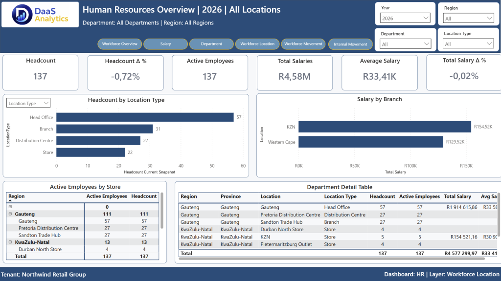
What the screenshot demonstrates
- Reusable header, filter and tenant context across layers.
- Layer navigation for Workforce Overview, Salary, Department, Location, Movement and Internal Movement.
- Governed KPI strip that stays consistent while the analytical layer changes.
- Detailed visuals and tables aligned to the selected layer without leaving the dashboard module.
For a technical architecture page, this screenshot should be paired with a simple layer diagram. On the website, it works well as a product proof image because it makes the layered concept tangible.
DaaS platform visual examples
The platform combines a consistent executive layout with specialised layers for sales, product and finance. This lets leaders move from summary KPIs to the specific operational questions behind the numbers.
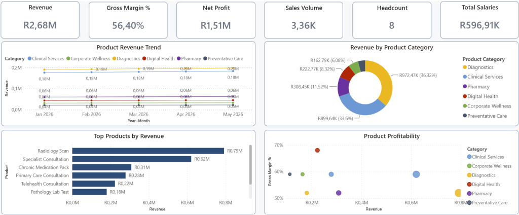
Governed layer design
Each dashboard layer uses the same visual grammar: KPI strip, trend area, ranked bars, explanatory tooltip pages and tenant-aware filter context. That consistency reduces training effort and makes the solution easier to extend by module.
- Executive-ready KPI context.
- Layered views for Finance, HR, Sales and Operations.
- Reusable layout standards across tenant deployments.